


Our Work
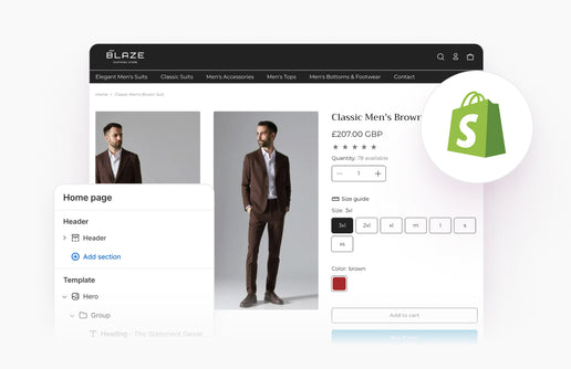
We take pride in having fantastic clients ranging from startups to national enterprises. Their repeat business and referrals have helped us gain significant recognition in the digital sector. Why not check out some of the work we've done?
We take pride in having fantastic clients ranging from startups to national enterprises. Their repeat business and referrals have helped us gain significant recognition in the digital sector. Why not check out some of the work we've done?
Talk To Us
Get in touch today to see how we can help you achieve your digital goals through web development, branding and digital marketing.


