A plain black banner.
Olison group logo.

The Task

Olison is a leading company specialising in the installation and maintenance of air conditioning systems across a wide range of sectors including commercial, industrial, public sector, hospitality, retail, medical, laboratory, education, IT and server rooms. Known for high quality services and strong technical expertise, Olison has built a trusted reputation for reliability and precision. As the company continued to grow, they recognised the need for a brand evolution that would reflect their commitment to innovation and excellence while preserving the core elements of their established identity.

The project focused on refreshing Olison’s brand without straying too far from the original logo mark. The aim was to modernise the visual identity so that it communicated movement and accuracy, aligning with the company’s mission and values. This evolution needed to be subtle, retaining the familiarity that clients and stakeholders associated with Olison, while enhancing the brand’s presence in a competitive

Client

Olison Ltd

Services

Brand Identity

Brand Guidelines

Print Material

Olison logo.

The Logo

When creating the new logo for Olison, our aim was to develop a simple and modern mark that clearly expressed movement and accuracy, both central to the company’s services. The final logo features a mark paired with a custom logotype, each built from the same geometric forms to maintain cohesion. The design went through numerous refinements to achieve a careful balance between familiarity and contemporary appeal.

Olison brand guidelines.
Olison logo.

Brand

The colour palette centres around a clean monochrome base complemented by a bright pop of blue. This decision ensured a professional and versatile foundation, while the blue accent introduced a dynamic quality that stands out across print materials, vehicle livery and advertising. The result is a logo that feels fresh and confident while remaining practical for everyday use.

For typography, we selected Fractul for Olison's title font due to its alignment with the characteristics of the main logo mark. Fractul is a geometric sans serif with architectural qualities, evoking the same sense of precision and structure that Olison embodies. Its clean lines and modern aesthetic complement the logo mark, creating a cohesive and professional visual identity.

The Olison logo on a building.
The Olison logo on a white helmet.
Olison brand guidelines.

Application

To fully realise the potential of Olison’s new brand identity, we extended the design principles across a range of practical applications. This included their fleet of vans as well as print materials such as business cards and letterheads. The new logo and colour scheme were applied to the vans to create a sleek and professional appearance that offers strong visibility on the road. These applications ensured that the refreshed identity was consistently represented across all touchpoints, reinforcing Olison’s commitment to professionalism and precision.

Olison brand guidelines.
A worker with a hard hat and ipad.

Sub Brands

A key requirement for the new logo mark was its ability to adapt across Olison’s various sub brands. Each needed its own colour scheme to distinguish its purpose while still connecting clearly back to the main Olison identity. We achieved this by developing a suite of colour variations that could be applied to the mark without compromising the overall brand cohesion.

This adaptability means that whether the logo is used for commercial projects, industrial solutions or specialist environments such as medical and laboratory settings, each sub brand maintains a consistent and recognisable look. This structured approach supports a unified brand image while allowing each service area to communicate its own strengths.

Olison construction logos.

Conclusion

This project highlighted the importance of balancing brand heritage with modern design principles. It demonstrated the value of creating an identity that feels both flexible and cohesive, capable of evolving alongside the company’s services and market presence. The refined logo and its adaptable sub brand system not only elevate Olison’s visual presentation but also reinforce their commitment to precision and innovation.

The successful evolution of Olison’s brand shows how thoughtful design can strengthen a company’s position in the market. By carefully preserving the essence of the original logo while introducing modern refinements, we delivered a refreshed identity that supports Olison’s continued growth and future ambitions.


Related Brand Projects

We've picked some projects that we think you might be interested in.
Why not take a look?

Glasgow national park city banner with a child playing in leaves.
The North Ayrshire swimming logo.

HAVE AN IDEA?

Do you need help with your brand?

Please don't hesitate to drop us a line if you require branding services for your business.

Arran Aromatics product page.
Douglas Laing family photo.
An Arran Aromatics gift box.
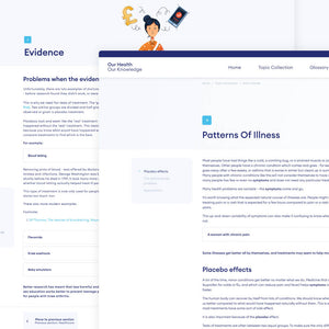
Our Health Our Knowledge website.
A Douglas Laing collection page.
Glasgow National Park City subway banner.
Brewgooder mobile website.
The Mademoiselle Macaron product page.
Our Health Our Knowledge website.
A pair of hands cupped holding water.